Thursday, May 10, 2012

Last Entry for Class

I was just looking around and I saw a bottle of Absolut that I saved.  #1 the body copy on the bottle is a script typeface so it makes me not want to read all of it.  And #2, the body copy is centered and because it is rather long, it also makes it hard to follow.


Monday, April 30, 2012

Logos I Didn't Like...

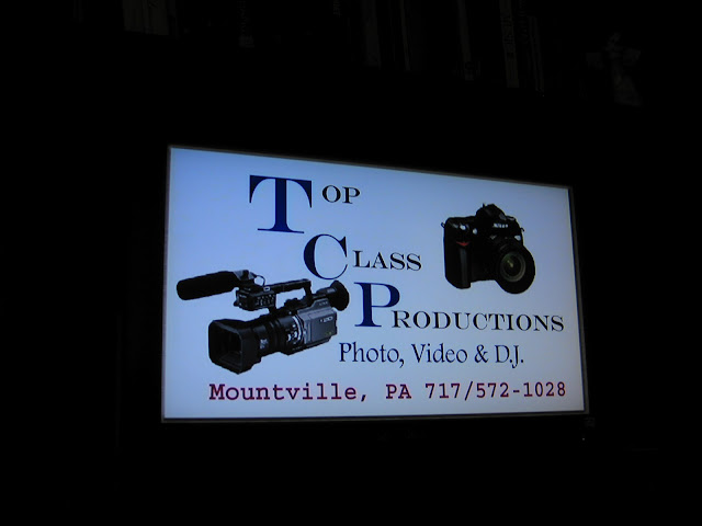
Saw this video at Mulberry Art Studio when I checked it out as a possible wedding venue.  The design of the ad is just awful, the pictures are just placed on it with no real interaction with the text, the title of the business is all over the place with it's text, and the choice of typefaces is also not the greatest.  I want to know why the "OP" and "LASS" and "RODUCTIONS" are all in different alignments with the T C and P.  I think it's most noticeable with the "OP" and "LASS" but all in all, it's just a lousy logo.

I was driving to school (stopped at a red light) and saw this work truck.  It's not the absolute worst logo that I've seen but there could've been a few things that would've worked better.  I think it's funny how the "BUILDERS" typeface is really curly and almost too feminine to be a manly workplace.  I can't be sure but I think on the phone number the dash is not the correct one either.  The image might work better if it was interacting with the text more than what it is.  But the script typeface for "Gerard" doesn't exactly go with the concept of being builders.  The typefaces only work for the sense of being a "classy" or "elegant" building company but I do believe that it is too feminine for this company.  Also, why is it a picture of a mailbox if they are builders?  Wouldn't a house or a wall work better?

Thursday, April 19, 2012

Tattoos and Kerning

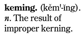
Kerning is important to think about.  Especially when it comes to getting a tattoo haha.


Tuesday, April 3, 2012

Week of 4/2/12

 Went to an author talk at Pucillo last Wednesday and checked out the banners for all of the sports sponsors.  Saw these two banners and noticed that they used dumb apostrophes with no slant to them at all.  I also thought that the Conestoga Tours banner's slogan didn't have enough space between the "Places..." and "The".

Monday, March 26, 2012

Intro

Just a blog for my Typography class to find good and bad examples of typography.